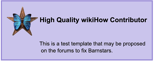
As some of you may know, currently, Barnstars don’t really work right on redesigned page, so I came up with a new design that does work with the redesign, and fits more with the wikiHow style. Here is what I currently have:


This example is of the regular Barnstar, but it would be easy to incorporate all of the Barnstars into a similar design. The part that says, “This is a test template that may be proposed on the forums to fix Barnstars.” will be replaced to include the personal message. You can see the Barnstar on this page .

I have tested this template, and it works perfectly on redesigned pages, including user and talk pages. Also, I managed to fix the code so that it also works well on most talk pages with custom designs. It should not affect the design, and the design should not affect the template.

Another good thing about this template is that it is responsive! YAY!:confetti_ball:While it may look wonky on small screens, you will still be able to read the message without any issues.

However, despite its benefits, it can be affected by some more complex designs. If your talk page has very large boarders that squeezes the messages, or if your user page has very complex designed that does things like change the font color, then issues may arise. This cannot be fixed because it is impossible to support every talk and user page design. But, this would be an issue with the current Barnstars as well.

Also, horizontal Barnstars cannot be supported, since they don’t make sense to use with the current wikiHow design. So my proposal also involves redirecting the horizontal version of Barnstars to the regular ones so that any Horizontal ones would be kept on the pages that they are already on.

And, while all Barnstars can be updated, the crafty Barnstar may have some issues, since the image on that one has a background. If anybody would like to edit that image to fix it, or create a new image entirely, then that would be great.

I think that this change would be good since the current Barnstars have numerous issues, and they don’t match with the wikiHow style anymore. I think that even though this new design might not be perfect, it is still better than the current style.

Do you think that this new design should be implemented? Does anybody have anything that they want to change?

6 Likes

I think overall, the change looks good and I’m definitely in support of making barnstars responsive. My only comment is that something about the design with the regular barnstar doesn’t feel… enough, if that makes sense? Barnstars are special rewards that are given out to users who are doing extraordinary things and I feel like the current design is a bit too simplistic for how much weight it carries (most of the regular awards templates stand out a bit more than this proposed design). It might just be my old Middle School Art Student™ talking, though, because on a design level it’s definitely clean, functional, and could be implemented as-is.

4 Likes

Thank you for your feedback. I understand your concern. Unfortunately though, I’m not that creative when it comes to these things, so this is the best that I could do. I would be open to any ideas to improve the design. If you or anybody else have any ideas, I can try to incorporate them.

4 Likes

Id be up for the change. While simplistic it is, its definitely something thats needed that hasn’t been changed in more than these ten years I’ve been here. And with all these design changes that are going on with templates and User pages and all this reaponsiying - is definitely needed and any creativity to improve in any places should be thanked.

2 Likes

I don’t know too much with regards to design that could be applied here, so I’m also not quite sure I have my finger on what could be fixed - but I’ll toss out a few suggestions:

  • Maybe a minor change in the font. It stands out and feels a bit off for some reason. I’m not sure whether it’s the font itself, the color, or where it’s placed, though.
  • Perhaps a thin border? We have them on many of the awards template. I’d say a thinner border compared to the existing awards templates, so that it doesn’t crush anything or look like it’s screaming “LOOK AT ME”, but also so that it doesn’t fade into the page. (The green is nice and complements the site design, but it’s fairly subtle and I feel like it could be easily missed against the white background.)
  • I’m not sure how this would work, HTML-wise - but maybe putting the barnstar and the barnstar title in a “header” of some sort, where the green is, and then having the custom message on a white background with a border around it (sort of like how it looks on the Controversial template, although that’s not a good example of what I’m picturing - I’m mid-task right now, but could probably put together a messy sketch of it later). That way, the message written to the contributor stands out a bit more, and doesn’t get visually “lumped in” with the header.
  • Experimenting with different colors might be neat, too. I wonder if maybe we could mess around with some of the colors common in the wikiHow color scheme (like the golds/yellows or other warmer colors) to make it “pop” a bit. And it could be a neat way to add some variety to different barnstars if we had different colors for different barnstars that still matched wikiHow’s color scheme, like blue on the barnstars that have pops of blue on them (e.g. the Quality Contributor barnstar). Though we should be careful to make sure there’s decent contrast between the barnstar and the background color, because things like the Dedicated Contributor barnstar or the Ambassador Barnstar could fade into certain yellows and be hard to see.
3 Likes

Thank you for this. I have made some changes to add the border and I have made some example templates that all use the wikiHow Color Pallet . You can see the examples here . Do you or anybody else think that they look good?

I don’t know much about font, so I really can’t help there. I’d be open to ideas. It’s pretty simple to change the font.

And unfortunately, I cannot implement a change where the Barnstar and title would be in a header, and the message in a whitespace because of how the code is written. The issue is that I have 4 different div tags in the Barnstar that I need in order to lay the template out properly, and to allow it to work with custom talk and user page designs. Also, I cannot specify a size for a border around the div tags inside of the Barnstar, since that would prevent the template from being responsive.

2 Likes

I think it’s a good start. I might darken the borders a bit so that they stand out a bit more, and maybe thin them just a little. Maybe we could dabble with figuring out which barnstars complement the colors best - the purple doesn’t look great when paired with the regular barnstar, for example, but it meshes fairly nicely with the Quality Contributor one. I tested that barnstar on the blue background, too, and am showing them both so it’s easy to see how they look. (I kind of prefer the blue on this one, though.)


(Sorry for it looking a bit funky - I borrowed R2’s Sandbox page and previewed without publishing anything, so the text looks a bit squashed.)

I also tested out the Ambassador’s Barnstar on the yellow and orange backgrounds to get a feel for how it might look when the barnstar is a similar color as the background, or an analogous color.

Also, with regards to the header… I feel like there has to be some way to do it, because I know I’ve mucked around with HTML in the past to put color behind a double border and put white over it (though to be fair, this was long before the redesign). I might mess around with it in the Sandbox template and see if I can get it functioning and still responsive, but don’t expect wizardry, because I’m no HTML master. lol

4 Likes

I support the change. I think matching different colors with different barnstars as experimented with above adds a nice touch, too, rather than keeping them all exactly the same. Helps them pop out a bit more.

3 Likes

The different colours are a bit difficult for me (and probably some other people) to read, which may become an issue.

1 Like

How so - in terms of accessibility, like you can’t actually see the difference between the colors and the letters and/or barnstar image, or are your eyes just being drawn to the wrong spots? Because both of those are fixable, but it depends on what the issue is.

1 Like

Double-post to update on the header, sorry:

I was able to get a sloppy but semi-functional version of the “header” working on the Sandbox template by enclosing another box within the divs. I managed to get it properly fitting in the template using the outline parameter, which seems to function fine on computer screens:

But it doesn’t work all that well with responsive.

Using it without the outline results in a thick green “border” around the white that I’m not a fan of, design-wise, and the border parameter crushes the text inwards rather than extends outwards.

So conclusion: a messy version is possible, meaning a cleaner version is probably possible too, but if we were to pursue that look, we’d need someone with a better knowledge of HTML than I have.

4 Likes

I struggle to see the difference between the text and some of the colours. The text is still readable for me but it is quite difficult.

2 Likes

Gotcha, so it’s an accessibility issue - I imagine it can be fixed by changing the color of the text and/or lightening the backgrounds. Are all of them giving you difficulty or just specific ones?

2 Likes

It’s mostly the purple and blue ones that are giving me difficulty.

2 Likes

I gave white text a try on the current colors of the blue and purple ones:


And I tried black text with a reduced background color.


Are either of those easier to read for you?

3 Likes

All of them are easier for me to read.

2 Likes

In order to make this work, the template would probably have to be mostly rewritten. When I wrote the template, I did not expect this type of design, so the code is not written to support something like this.

Also, I prefer the versions of the templates with the black text.

2 Likes

I believe that the issue may be that the text next to the Barnstar “wants” to be next to the image, if that makes sense. When you start to squeeze it, you force the text to move down, and then it’s div tag starts to overlap with the personal message’s div tag. This isn’t noticeable when you use one color, since everything is the same. But when you try to change the colors of one of the sections, then the overlap becomes noticeable. I hope this makes sense.

It’s late for me right now, so I can’t look at it, but I’ll take a look tomorrow (or I guess for me, latter today:stuck_out_tongue:).

I don’t think that’s it. I think what’s going on here is that the outline parameter puts itself on top of existing text, and I don’t know if there’s a way to override that. It does it when I try putting text outside the border/outline, too. So if I write test and then use this code:

 <div style="max-width: 500px; height: auto; width: auto; border: 1px solid black; outline: 0.5em solid black;">test</div> 

It creates this.Screen Shot 2021-01-26 at 8.56.26 PM

I think it’s just a built-in limitation of how the outline parameter works, given that they’re not nearly as versatile as borders (which also don’t work for this situation).

(edit: unless I completely misunderstood you and you meant the title falling into the white section, in which case, my bad - I’m tired aha)

I did a bit more fiddling and tried removing the padding in the original template, where the green is, and it actually did get the white to fit properly, but it ended up crushing the barnstar title against the side of the template in the preview, which also looks bad.

Putting padding around the barnstar and title also didn’t work properly because they’re using the float properties, so they just ended up smushed in random places inside the template. Though honestly, I didn’t expect it to, baha.

I might try and fiddle with it more tonight, but I don’t know if I’ll be able to fix the issues.

1 Like

I just loved the top two for the blue butterflies and how the colors complement each other. The yellow and the orange are also pretty calming to look at.

The ones with the white text look pretty classy.

I prefer horizontal barnstars.

Thanks R2 and Alex for working on it.:slight_smile: